Nordic / visual brand identity
We created a visual identity for two nordic marketing events in Asia organised by nordic countries. In Seoul, Norway and Finland exhibited together. In SIAL Shanghai the nordic pavilion was created in collaboration with Denmark, Sweden and Finland. The “Northern lights” concept combines all nordic flag colours and creates strong joint visibility. Natural, premium, well-being and innovativeness are the combining brand attributes for the varying participant country combinations. Balancing Nordic joint visibility without losing the great country visibilities requires careful planning so as to bring the best out of from the collaboration and joint efforts. Creating a strong overall impression and visibility is important in the context of the massive exhibition centres hosting professional trade fairs to help stand out from other big exhibitors. Clear messages and impressive large scale visual elements become essential in the task.


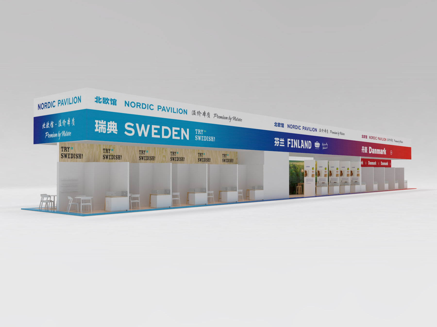

CLIENT: Finpro – helps Finnish SMEs go international, encourages foreign direct investment in Finland and promotes travel to Finland. SERVICES: Nordic event identity, Grand Hyatt Seoul and SIAL China trade fair 2017. YEAR: 2016 – 2017 CREDITS: Concept co-created with: Matts Bjolin, 3D renderings: Nicolas Pratt / Another Angle, bodytext typography: following Finnish national identity guidelines.